MUG BRAND REFRESH
MUG BRAND REFRESH
Bringing Mug’s brand refresh to life; from logo sketches to an experiential campaign.
EXPERIENTIAL MARKETING | GRAPHIC DESIGN | BRAND IDENTITY
Overview
This project modernized Mug Root Beer’s design while preserving its nostalgic appeal. By refining key brand elements and introducing a comprehensive kit of parts, the refresh strengthened its personality and flavour profile to stand out among competitors. The launch included an experiential marketing campaign, social media, and brand collaborations to expand reach and engage consumers.


Research & Process Work
I began with in-depth research on the brand, market, and competitors, including a SWOT analysis.
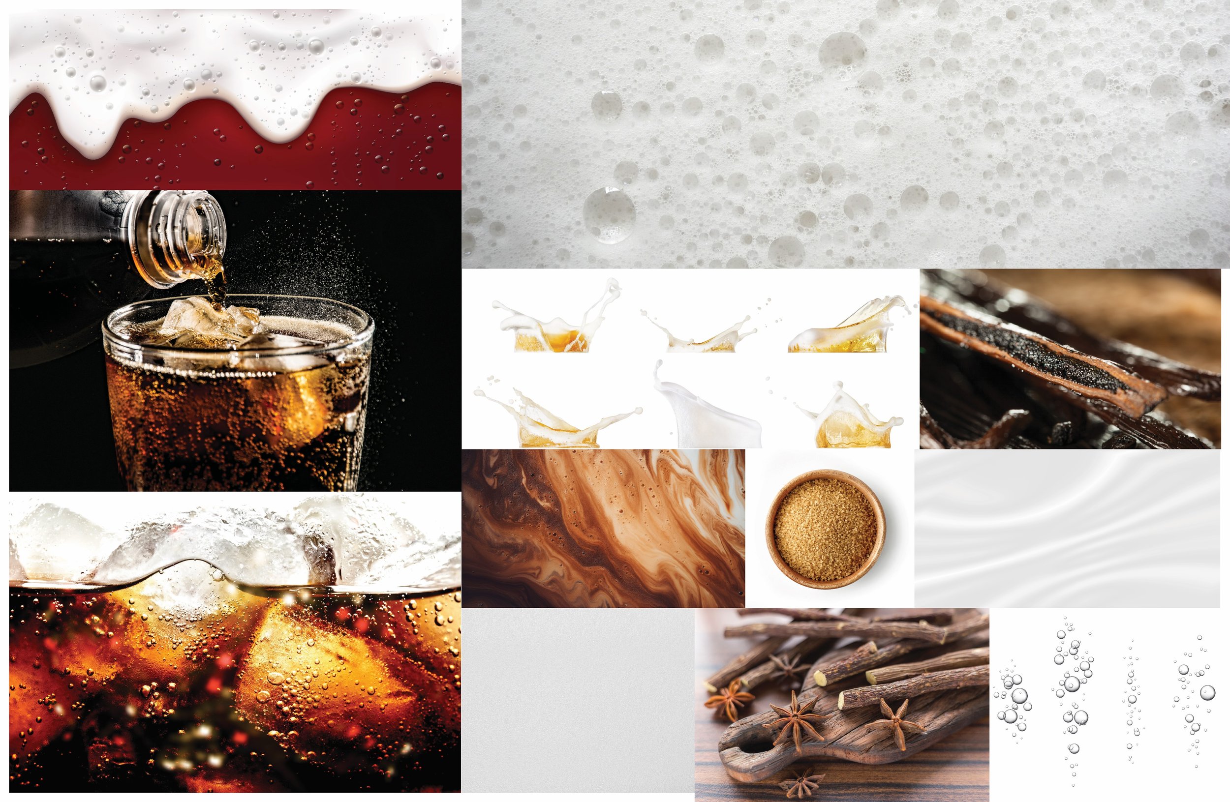
After sketching logo refresh ideas, I digitized my favourites in Illustrator and curated moodboards for typography, colors, and textures. Using these, I refined logo iterations, applying them to can designs with key brand elements like bubbles and foam.
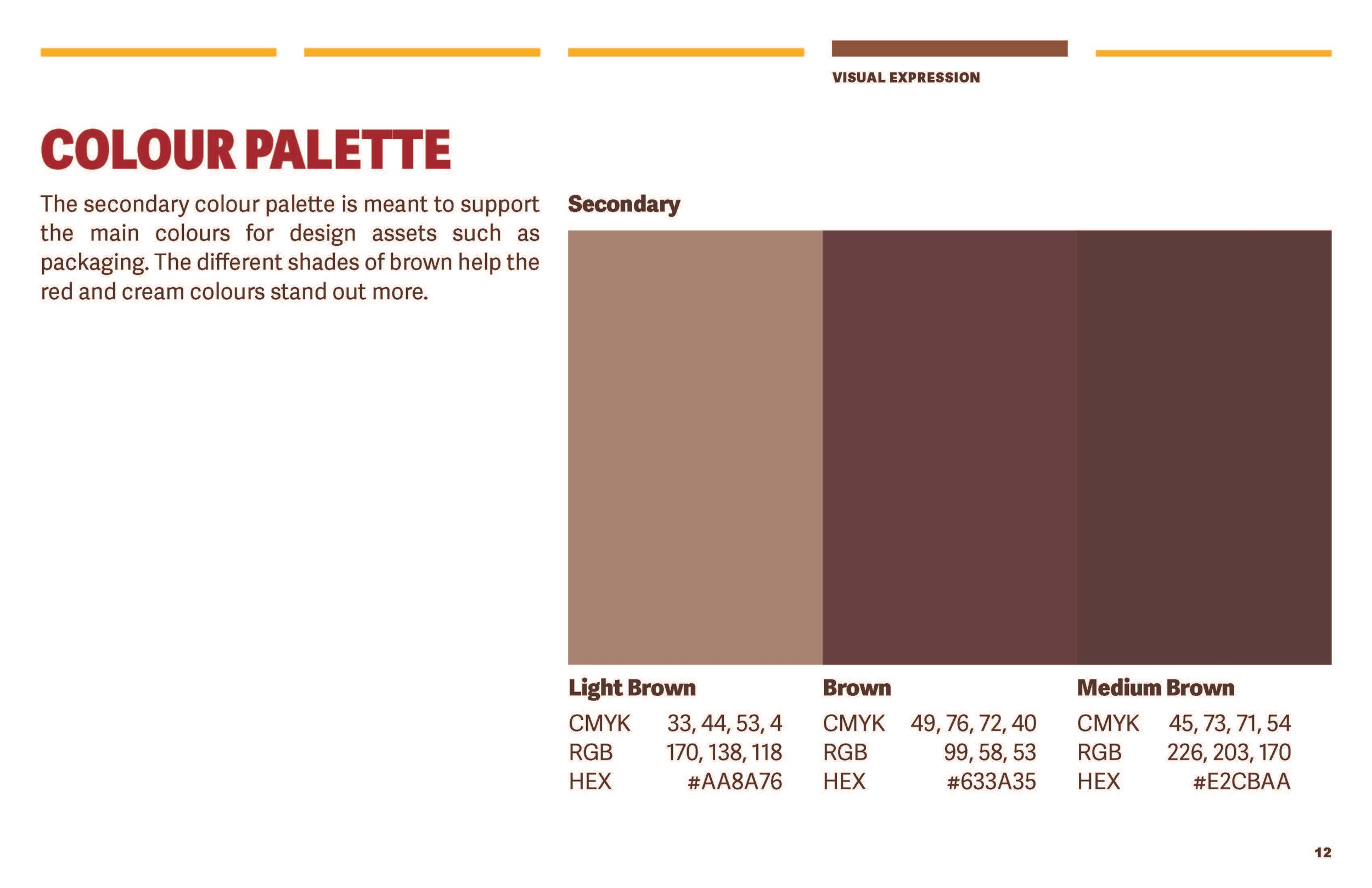
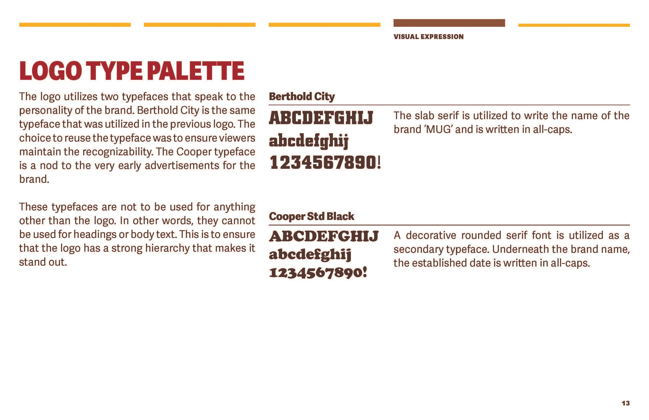
The warm colour palette enhanced the drink’s appeal, while typography complemented the original branding for a cohesive update.




Visualizations
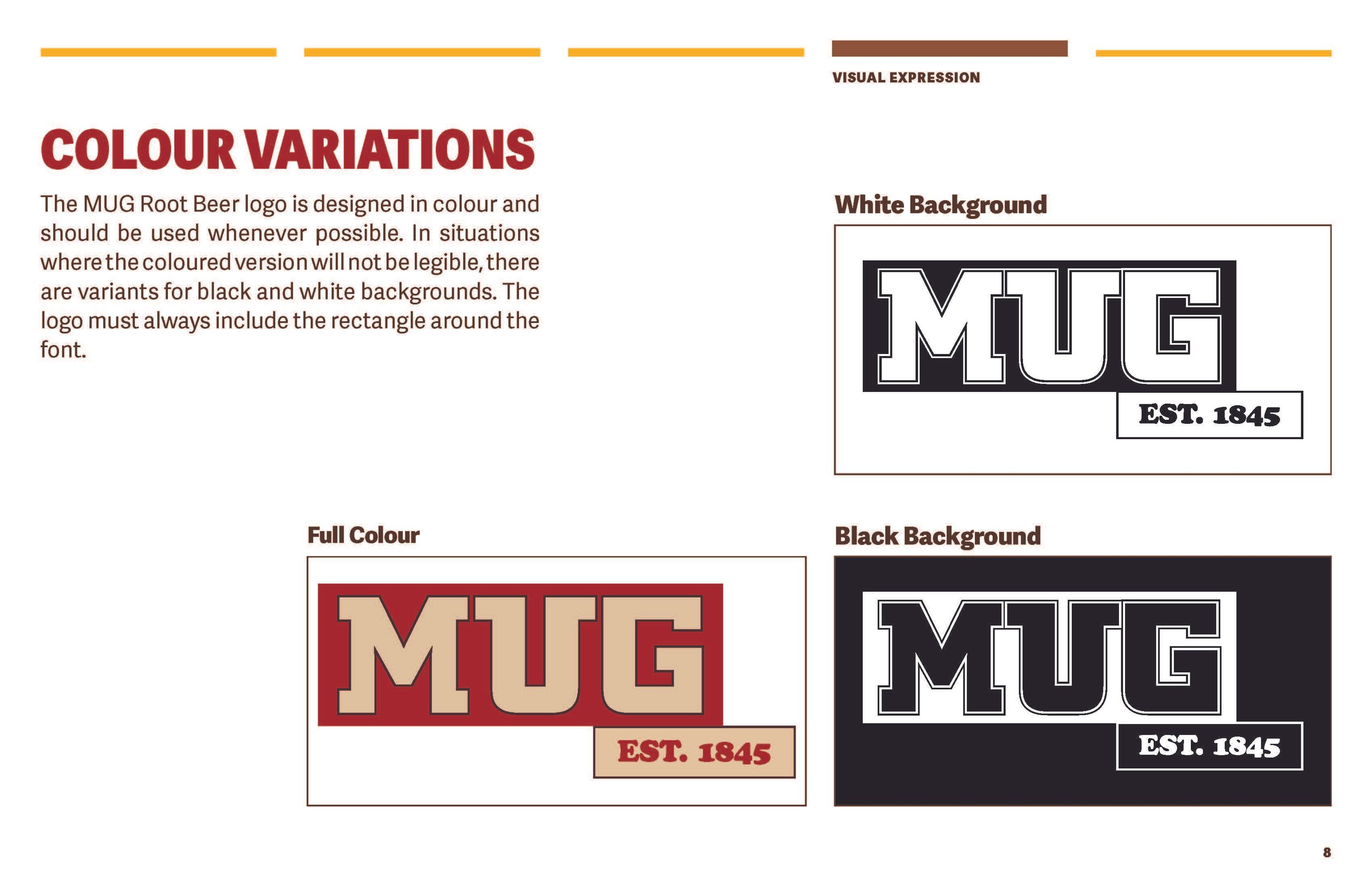
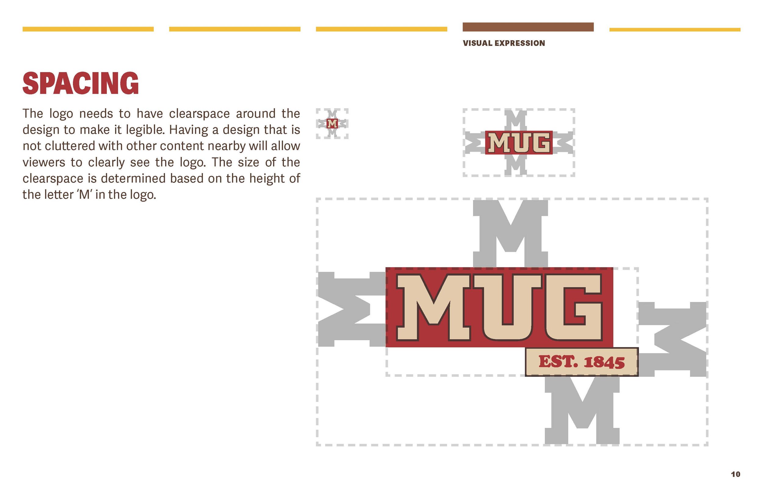
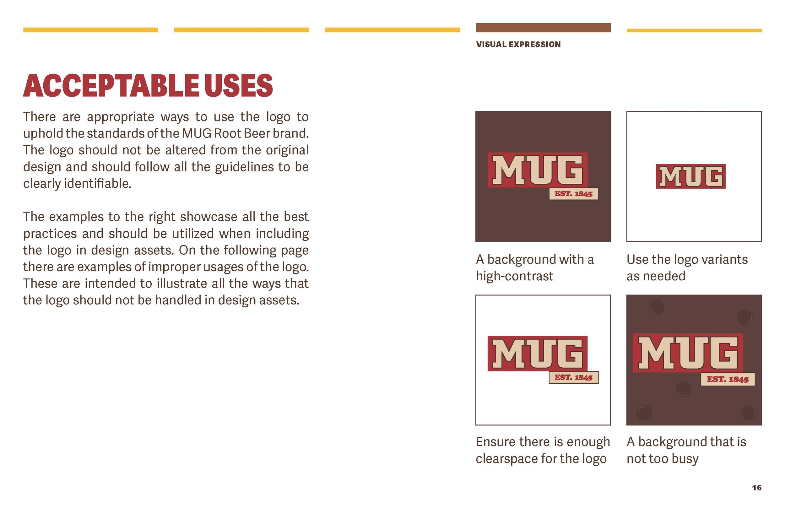
After finalizing the logo design, I developed a set of brand guidelines outlining logo variations, sizing, spacing, and colour and typography palettes.
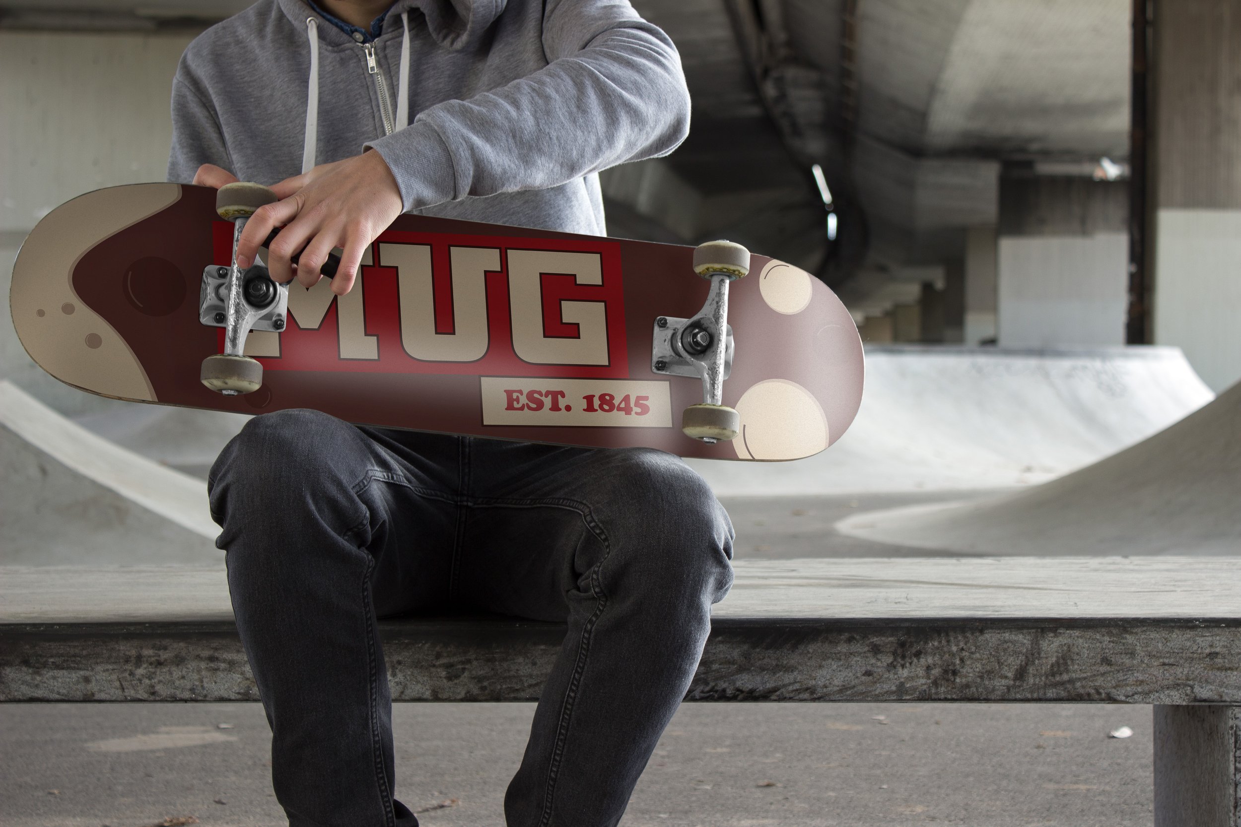
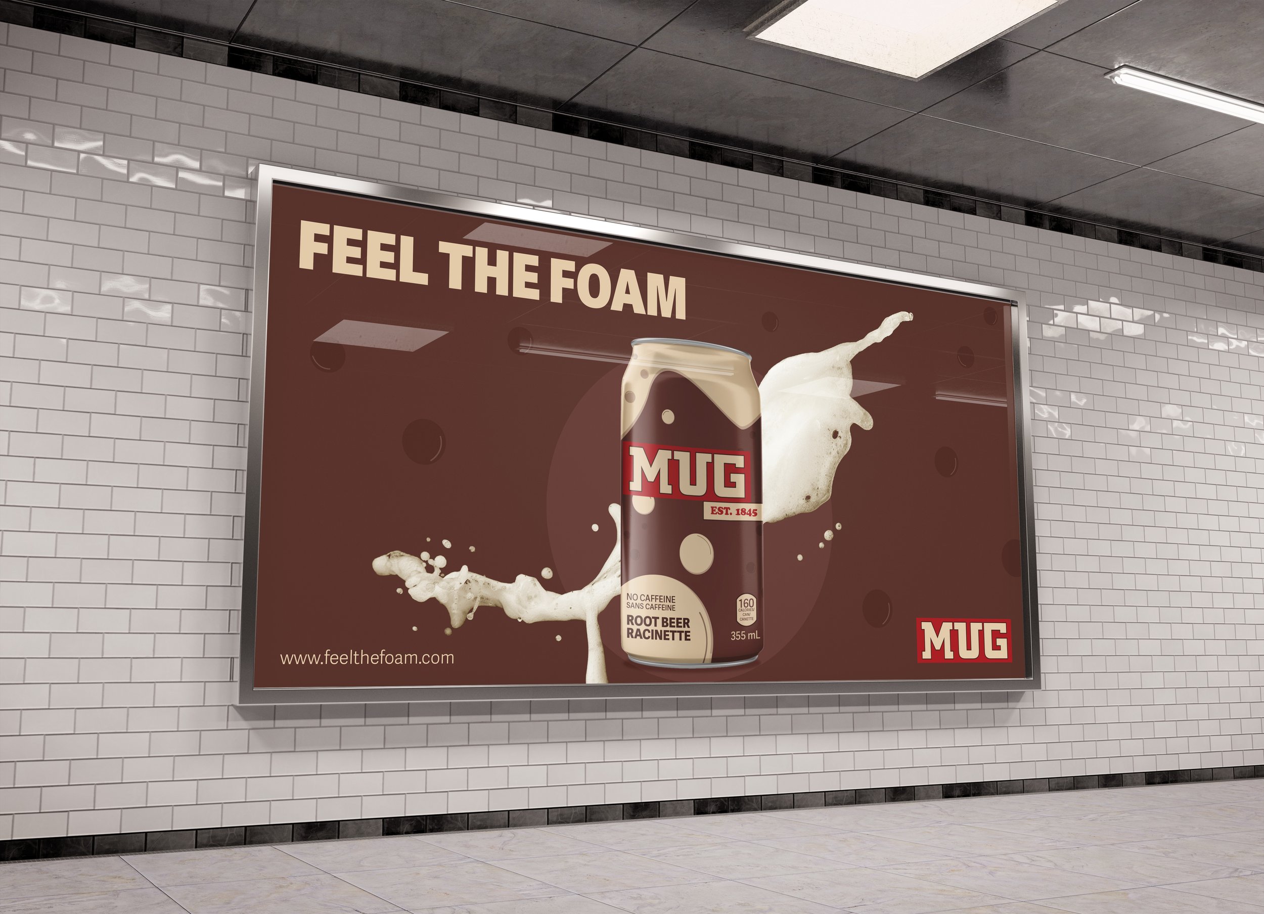
To showcase the branding in use, I created a series of mockups demonstrating its application across products, large-scale environmental graphics, and digital assets.
Experiential Marketing Extension
The "Feel the Foam" campaign promoted the brand refresh through an interactive foam party with in-person and virtual experiences.
To engage teenagers, a Fortnite collaboration offered exclusive themed bundles. A cohesive promotional poster was designed for print and social media.
The campaign aimed to build brand loyalty and reinforce Mug Root Beer’s personality through a fun, immersive experience.


